Picture this – you’ve got a shiny new logo, but something still doesn’t feel right. That’s because branding is more than a logo. It’s the whole package. And if your brand doesn’t feel like you, it won’t feel right for your clients either. There are practical steps you can take to make sure it attracts the right clients and helps your business grow.
That’s something Dave Bradburn of Opus Creative Design and I discuss in the latest episode of You’re Not the Only One, where we dive into brand strategy and design in a way that’s practical and relatable.
Dave and I chat about why brand strategy always comes first, why consistency is everything, and why colour psychology is more powerful than you might think.
Prefer to watch?
Catch the full episode over on YouTube here:
More than a logo: branding explained
Dave explains that branding is so much more than a logo and, as one of the first things potential clients encounter, it needs to be inclusive.
- A logo is only one part of your brand.
- Colours, fonts, tone of voice all play a role.
- Every element should be there for a reason.
Why brand strategy and design go hand in hand
Without a marketing or brand strategy, design can be difficult to get right. Sure, Dave can create something amazing, but will it help your business grow in the right direction?
- Without strategy, design is guesswork.
- Know who you want to reach before you brief a designer.
- A jokey logo won’t work if you’re targeting professional services (and vice versa)
Brand guidelines: why consistency builds trust
Brand guidelines helps to keep your look, tone of voice and everything about your business consistent.
- Consistency builds trust.
- Even a simple guide should include: colours, fonts, logo rules, tone of voice.
- Helps everyone (designers, printers, web teams) stay on the same page.
- It doesn’t need to be 100 pages long – even a one-page guide gives your business the structure it needs to stay consistent.
Branding tools for non designers
What tools can those without a flair for design use?
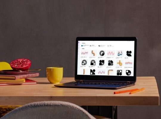
- Canva has its place (quick, easy, good for templates).
- Adobe Express is another option, though less intuitive.
- Rule of thumb: one idea per logo, keep it simple.
The role of AI in branding and design
Like the tools already mentioned, AI should also be considered a tool. It has it’s advantages and disadvantages and will undoubtedly improve over time.
- AI is a tool, not a threat.
- Great for cut-outs, resizing, quick edits.
- Not great at originality, copyright, or print detail (yet).
- In other words, use it for shortcuts, not strategy.
Colour psychology in branding
The colours you use in your branding will have an affect on your audience. What response do you want from your branding?
- Red = energy, action, attention.
- Blue = trust, calm, loyalty.
- Colour choice should match your audience, not just your personal taste.
Branding lessons from business experience
Dave shares some insights into what he’s learnt since being in business.
- Rebrands can be tricky – people get attached.
- Self-belief matters (imposter syndrome is real, but growth happens outside your comfort zone).
- Networking works – often it’s about the relationships, not just the work.
Watch the full conversation
There’s plenty more in our chat:
Need a hand with your brand strategy?
Your brand is the whole package – strategy, consistency, design, psychology.
If you’re ready to build a brand that feels like you and works for your audience, book a brand strategy chat with me. And if you need design expertise, you can find Dave at Opus Creative Design


